Noble Life Sciences’ Latest Rebrand Brings Values to Life Through Color and Imagery
How a Preclinical Contract Research Organization (CRO) Refreshed Their Visual Brand to Stand Out From the Competition
In the hustle and bustle of planning experiments, growing a business and improving services, visual branding often stumbles toward the bottom of the priorities list for life science companies. While companies used to be able to get away with quickly putting a logo together and creating a scrappy website using a pre-existing Wix template, an increasingly crowded life sciences market is making leadership teams rethink their visual presence.
Noble Life Sciences, headquartered in Sykesville, MD, is a preclinical development partner that helps its clients conduct exceptional quality research to advance human health by providing comprehensive preclinical services. The team pursues this mission with three core values as their “north star”: passion, integrity, and innovation. While Noble’s client partners know and can attest to the high caliber of the team’s service and work, Noble realized that its visual brand could do better to reflect this.
A Competitor Brand Analysis Unveils Opportunities
Just as one would do a market analysis to better understand the competitive therapeutic landscape, it’s immensely helpful to channel your inner artist and see how your visual branding stacks up against other companies. What kind of color palette do your competitors use? What does their website look like? What kind of images and photos do they use?
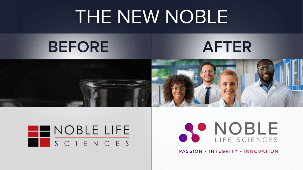
For Noble, the team found that many of these competitors used similar shades of darker blues and grays. Take a look at Noble’s old logo, and you’ll see that the darker gray is also very prominent.
Time for a glow-up.
Survey Says…
If you’re a reno show connoisseur, you’ll know that designers don’t just dive right into redoing a home once the paperwork is signed – they want to make sure that the design aligns with the owners’ wish list. Similarly, Noble surveyed its employees to gauge what they wanted the new brand to convey.
One of the key phases taken from the survey was that employees wanted the new brand to communicate a “transition toward progress and moving forward.” When asked what words would describe the company, employees used words such as:
- Progressive
- Flexible
- Innovative
- Productive
- Responsive
- Trusted
- Collaborative
- Quality
- Integrity
While the previous logo had set a strong foundation for Noble, it was time for the company to show that it wasn’t stuck in the old way of doing things – the team is constantly innovating to provide the best scientific services to its clients.
Dabbling in Color Theory
As the team pondered their new color palette, they knew they wanted to keep a nod to the original red in the previous brand which, in color theory, symbolizes what drives the team – passion and love for what they do. Similarly, the team landed on purple as a new brand color to invoke feelings of nobility, ambition, creativity, wisdom, and devotion – all qualities that encompass how Noble serves its clients.
But it’s not just about color, but also about vibrance. Many of Noble’s competitors had “safer” colors – colors that were somewhat in the middle of being dull vs. bold. As such, Noble wanted its colors to be more vibrant and modern.
Then there is a matter of how the colors are used in the design. Will the colors be separate blocks of color, or will they blend together? Will colors be used to emphasize something, like a specific letter of the logo? The choice of using a gradient between Noble’s two main colors was very intentional, as team and clients working together result in amazing innovation and the potential for new, impactful medicines.
Taking Inspiration from Cell Biology
Many scientists, especially ones that are more cell and molecular biology-focused, don’t think that they have an artistic bone in their body. And while most scientists are not going be the next Rembrandt or Van Gogh, when you take a step back from pipetting you might realize that science can, in fact, provide great artistic inspiration.
Take a closer look at Noble’s new logo mark, and you might see some resemblance to cells and cell division. As with the other design choices, this was no accident. When asked what key visual element best represents the company, many employees responded with “cells”.
While we all know what a cell is, when you look back to the basic definition you’ll see, “A cell is defined as the smallest, basic unit of life that is responsible for all of life’s processes.” Thinking back to evolution, a single cell can be thought of as a beginning.
Not only does the image of the cell literally represent the services Noble provides, but the idea of “beginning” is a nice nod to the fact that preclinical research, which is the company’s focus area, is one of the beginning steps of drug development. Taking it a step further, the team decided to use cell division to further symbolize growth and forward movement.
Bringing it All Together
What good is a fresh new brand if you don’t fully show it off? Open up Noble’s new webpage, and you get an immediate sense of warmth, calm, and welcome with both the new color palette and hero video showing collaboration and diversity. Scroll further through the page, and vibrant imagery catches your eye to invite you to explore the site to learn more about Noble’s therapeutic area and cell/gene therapy services.

Here is an additional peek at Noble’s new branding, which brings all the imagery and symbolism full circle to encompass the company’s vibrant culture.

Learn more about Noble’s service offerings, and check out their current open positions.
- About the Author
- Latest Posts

Sarah Ellinwood is BioBuzz’s Managing Editor. A scientist by training and a science communicator at heart, Sarah specializes in making complex concepts understandable, engaging, and exciting. She received her Ph.D. in molecular and cellular biology with a focus in infectious disease immunology from the University of Maryland and is passionate about all things related to scicomm, peer mentorship, and women in STEM.